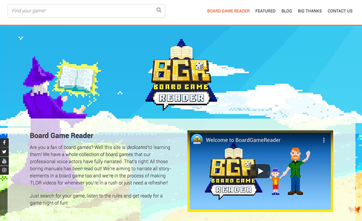
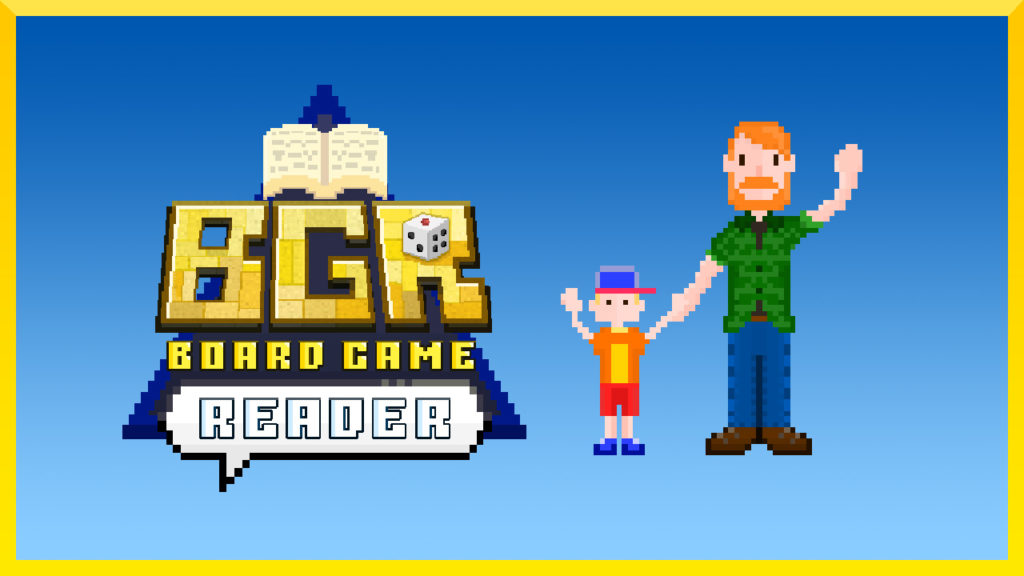
Board Game Reader

Click here to download my full portfolio (16.3mb PDF)

Origin

My personal hobby turned passion. From a combination of my desire to become a Voiceover Artist and enjoyment for boardgames, I found an opportunity that could serve both as publicity and practice for voice talents as well as produce entertaining content for the world of narrative boardgaming. The naming process took a little while but I settled for Board Game Reader as the title was direct and had a similar feel to other nomenclature like “PDF Reader”. And although BG Narrator would have the same connotation, having less syllables would be the better option going forward. I recognised the popularity of Let’s Play tutorials within the boardgaming scene and found myself one day thinking, “I wish there was an audio recording for this story text” and felt that this was a gap that I could fill.

Logo Design

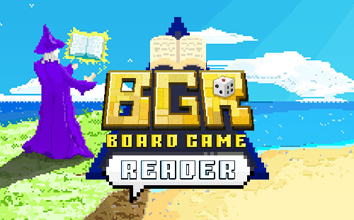
My first goal was to design the logo in such a fashion that it would be understandable and recognisable. Symbolism that would catch attention immediately and would implant the following ideas: Dice, Book, Speech, Wizard, Boardgame, Audio.

Later, I instinctively chose a retro style approach (given the latest trends for pixel art) as I felt this style was more clear, unique and it relied on basic colours that would attract attention. It also suited the audience that I intended to target, in both age demographics as well as interests; very often, a board gamer is also a retro gamer.

Logos 1 Logos 2

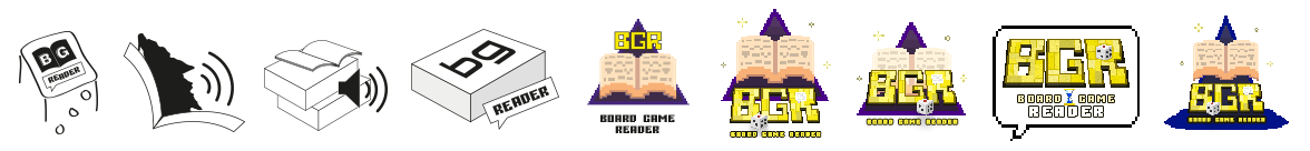
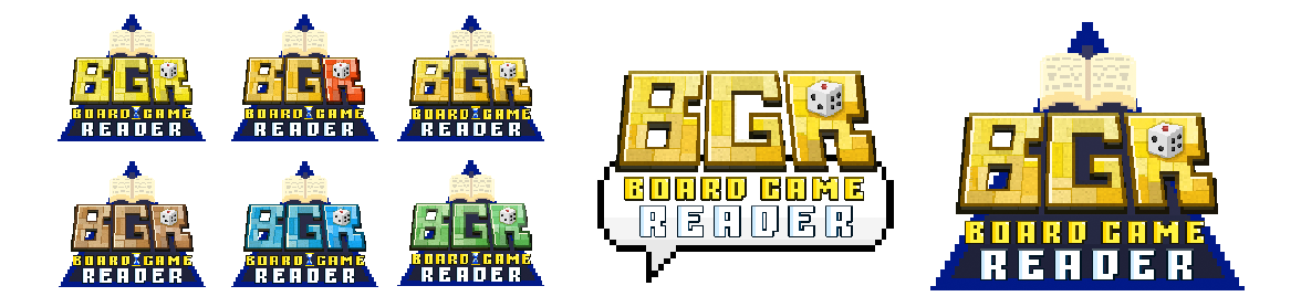
Taking positive elements from previous designs such as the blue from the blue-yellow combination, I experimented with other colours and found that a gradient was the most visually pleasing: it distinguished itself from the yellow Boardgame text below it and made it possible to insinuate that the BGR text was tiles or pieces of a board. At this stage, I decided to simplify and limit elements as much as possible such as the egg timer. The triangle in the background was integral to keeping the logo together however with the book protruding out from the top, with nothing at the bottom the logo seemed incomplete: hence the final logo has a speech bubble to reinforce the imagery of “Reader”.

Web Design

Designing the website was fun, again I wanted to go with the “Game Theme” so I used bright colours throughout. I love parallax style backgrounds, they really entertain my eyes by having “fun” with different perceptions! I loved it during Sonic 2 and I still like it to this day.

Website

YouTube Channel

Videography

I enjoy animating with Adobe AfterEffects. I’ve always loved the idea of bringing static things to life, but I’ve never had a chance to do it professionally but I’m glad to have these opportunities to experiment and explore creativity. I’m now equipped with a DSLR camera and a professional microphone so I’ll be doing some more videography in the near future. I’ve already prepared some scripts and all that’s left is to overcome some minute camera-shyness!

Project Management

Working with over 25 voice talents was a very new experience and ensuring that these files were ready to be uploaded before a major board game convention was a challenge. However the plus side that this resource is now permanently in the internet space for generations of future gamers feels like a great accomplishment. In either case this entire project has definitely opened up my entrepreneurial side and keeps me busy every day.

Projects

Instagram Photo

Marketing

Aside from social media marketing, I’ve personally visited many boardgames shops across the North West of England to distribute my fliers. I’ve also attended a few conventions and events with my own printed T-Shirt to spread publicity.