Ken Wong

Ken Wong Portfolio

Click here to download my full portfolio (16.3mb PDF)

Origin

Originally, my site was all about Graphic Design but since the decision to pursue Voice Acting, I’ve had this temporary theme in place. I had kept the designs quite simple just to reflect the most basic of information and my demo reels. However after some research, I realised that keeping it simple wasn’t enough as there were thousands of pages just like mine who try to reflect the person as much as possible. I needed an advantage because of this competitive scene and that’s when I came up with a brand.

Inspired by another Voice Actor whose fully associated with bears due to his lower tones and grizzled voice, I chose this Speedster Hero to symbolise who I am, how I sound and the quality of my service.

At first, I wanted to practice my drawing as I hadn’t done any nice sketching in years and I even went out to buy a mannequin to help me with this task, alas my drawing skills had unfortunately suffered. To speeden the process of creating this Hero and therefore this portfolio, I discovered some online mannequins instead which I had manipulated to get the poses I desired for my Hero.

Ken Wong Old Site

Costumes

The Costume

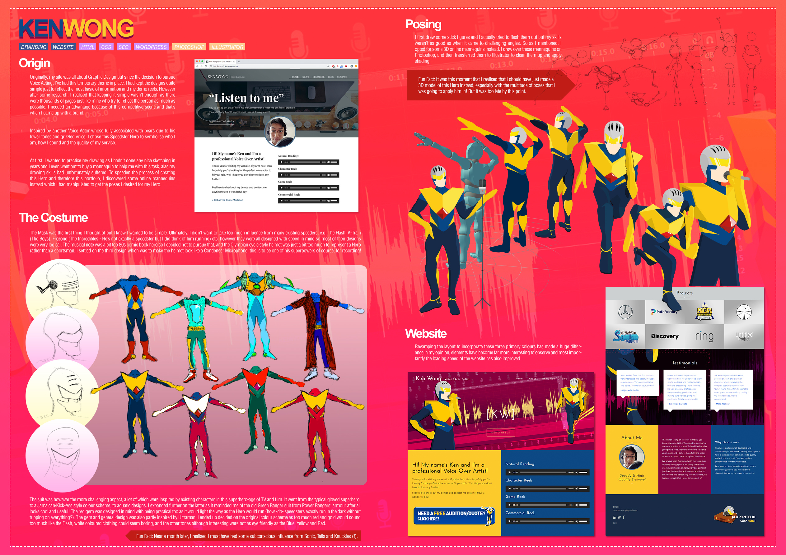
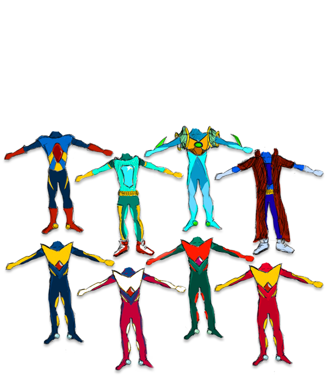
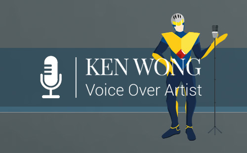
The Mask was the first thing I thought of but I knew I wanted to be simple. Ultimately, I didn’t want to take too much influence from many existing speeders, e.g. The Flash, A-Train (The Boys), Frozone (The Incredibles – He’s not exactly a speedster but I did think of him running) etc. however they were all designed with speed in mind so most of their designs were very logical. The musical note was a bit too 80s comic book hero so I decided not to pursue that, and the Olympian cycle style helmet was just a bit too much to represent a Hero rather than a sportsman. I settled on the third design which was to make the helmet look like a Condenser Microphone, this is to be one of his superpowers of course, for recording!

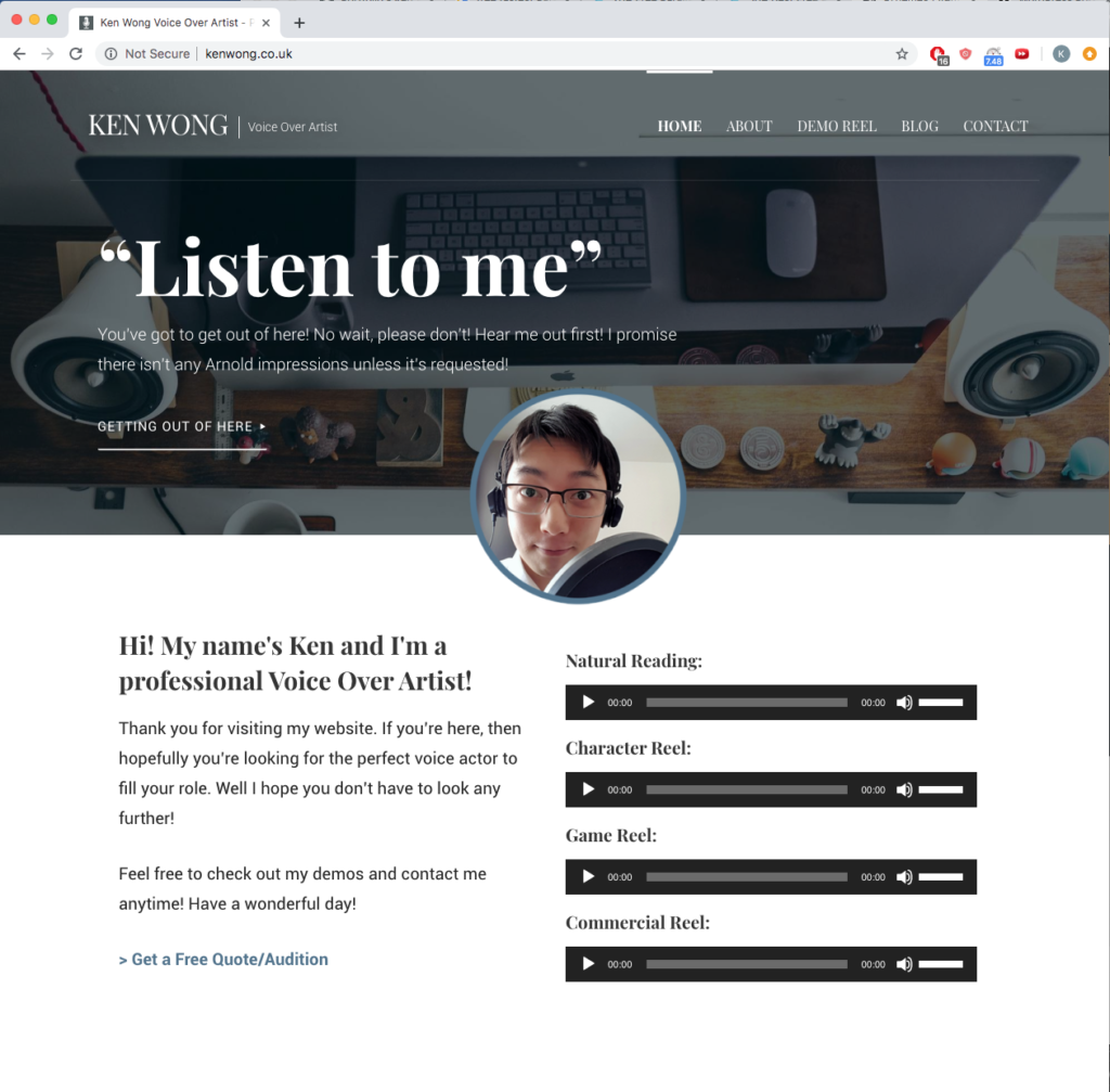
The suit was however the more challenging aspect, a lot of which were inspired by existing characters in this superhero-age of TV and film. It went from the typical gloved superhero, to a Jamaican/Kick-Ass style colour scheme, to aquatic designs. I expanded further on the latter as it reminded me of the old Green Ranger suit from Power Rangers: armour after all looks cool and useful! The red gem was designed in mind with being practical too as it would light the way as the Hero would run (how -do- speedsters exactly run in the dark without tripping on everything?). The gem and general design was also partly inspired by Ultraman. I ended up decided on the original colour scheme as too much red and gold would sound too much like the Flash, white coloured clothing could seem boring, and the other tones although interesting were not as eye friendly as the Blue, Yellow and Red.


Fun Fact: Near a month later, I realised I must have had some subconscious influence from Sonic, Tails and Knuckles (!).

The Poses

I first drew some stick figures and I actually tried to flesh them out but my skills weren’t as good as when it came to challenging angles. So as I mentioned, I opted for some 3D online mannequins instead. I drew over these mannequins on Photoshop, and then transferred them to Illustrator to clean them up and apply shading.


Fun Fact: It was this moment that I realised that I should have just made a 3D model of this Hero instead, especially with the multitude of poses that I was going to apply him in! But it was too late by this point.

Poses

The Website

Revamping the layout to incorporate these three primary colours has made a huge difference in my opinion, elements have become far more interesting to observe and most importantly the loading speed of the website has also improved.